

Trading Signals Guide for Kenyan Traders
📊 Understand trading signals and learn how to use market data wisely. Perfect for Kenyan traders aiming to spot buying and selling chances in NSE or forex markets.
Edited By
Laura Phillips
Trading charts are the backbone of any serious trading strategy, serving as a visual map of price movements over time. In Kenya, where many traders engage with markets ranging from Forex and local stocks to commodities like tea and coffee futures, mastering charts can significantly improve investment decisions.
At its core, a trading chart displays how the price of an asset changes within a given timeframe. Whether you’re looking at daily fluctuations on the NSE, tracking the shilling’s exchange rate against the dollar, or following global oil prices, charts offer a quick snapshot of market behaviour.
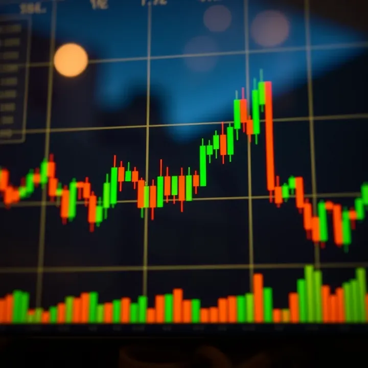
Charts come in various types — line charts, bar charts, and candlestick charts are the most common. Candlestick charts, for example, show opening, closing, highest, and lowest prices within a set period. This level of detail helps you spot turning points and trends that can influence when to buy or sell.
Understanding the timeframe you’re analysing is key. A 5-minute chart suits day traders hunting quick openings, while longer timeframes like daily or weekly charts help investors spot broader trends and avoid getting caught up in market noise.
In Kenya’s context, where many traders combine M-Pesa transactions with mobile trading apps to access markets, reading charts effectively means making faster, better calls on when to enter or exit positions. For instance, recognising a bullish pattern on the Nairobi Securities Exchange (NSE) can guide you on when to buy shares of Safaricom or Equity Bank before prices rise.
Identify the chart type best suited to your trading style
Understand how to read price data within your chosen timeframe
Learn to spot simple chart patterns like "head and shoulders" or "double bottoms"
Use basic indicators such as moving averages or Relative Strength Index (RSI) to confirm market strength
Mastering these basics equips you with a solid foundation to approach Kenyan markets with confidence and informed insight. In the next sections, we will deepen this understanding by exploring specific chart patterns, timeframes, and technical indicators relevant to your trading needs.
Trading charts are visual tools that show the price movements of assets like stocks, currencies, or commodities over time. In Kenya, whether you are dealing with NSE stocks or forex through platforms like FXCM Kenya, these charts are invaluable for tracking how prices have changed, helping you make better decisions rather than relying on guesswork.
A trading chart is essentially a graph that displays historical price data. It helps traders see where the market has been and spot possible future directions. For example, a trader observing Twiga Foods shares on the Nairobi Securities Exchange (NSE) might use a chart to understand whether to buy or wait. This visualisation is more insightful than simply reading numbers because it highlights patterns and trends over hours, days, or weeks.
Most charts include several key parts: price scale, time scale, and the actual price data shown as lines, bars, or candlesticks. The price scale runs vertically, showing the value in Kenyan shillings or relevant currency, while the time scale runs horizontally, showing intervals such as minutes, days, or months. For instance, on an hourly forex chart, you can see how the Kenya shilling has fluctuated against the US dollar during trading hours.
Volume data sometimes appears below the price section, indicating the number of shares or contracts traded. This helps identify how strong a price movement is. A big price move with low volume might not be reliable.
Charts make it easier to spot trends—whether prices are generally rising, falling, or stuck within a range. This matters because trends often determine profits or losses. For example, a trader watching Safaricom stocks might notice a rising trend before an earnings report, signalling a potential buy opportunity. Conversely, spotting a downtrend early helps traders cut losses.
"Without a clear picture of market trends through charts, traders risk making decisions in the dark, relying only on hearsay or incomplete information."
Good trading charts guide you on when to enter or exit the market. If you see chart patterns like a "double bottom" or an "upward breakout," these suggest buying points. Conversely, patterns like "head and shoulders" might signal it’s time to sell. Say you are trading Kenyan tea futures; spotting a reversal pattern could save you from a bad trade.
Besides patterns, charts combined with indicators such as moving averages help time these decisions more precisely. Using charts means decisions are based on actual price behaviour, not emotions or rumours.
In summary, understanding trading charts and their components equips Kenyan traders with a practical edge. This is especially true in volatile markets like forex or NSE stocks, where rapid changes demand quick and informed action. Applying chart insights sharpens your trading routine and improves your chances of success.
Understanding different types of trading charts is key for anyone looking to navigate the markets effectively. In Kenya, where traders often deal with assets ranging from NSE shares to forex and commodities, knowing which chart type fits your style can make a big difference. Each chart presents data uniquely, offering insights into price movements and market behaviour.
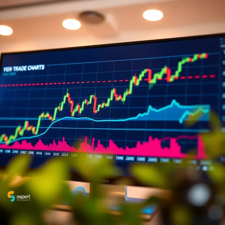
Line charts connect closing prices over a set period with a simple line. This straightforward approach strips away extra details to show the general direction of an asset’s price. For example, if Safaricom shares close at KSh 35 on day one and KSh 36 on day two, a line connects these points to illustrate the trend. It’s easy to read, especially for beginners or those tracking broad trends without the noise of intraday fluctuations.
Line charts work well when you want a quick snapshot of overall market direction. Kenyan investors monitoring agricultural commodity prices for export might use line charts to spot general price increases or declines over months. However, they’re less suited for detailed trade timing since they omit daily highs and lows.
Bar charts show more details by displaying each trading day’s opening, closing, high, and low prices with vertical bars. The left notch marks the opening price, the right notch the closing price, and the bar itself the price range. This structure helps traders see volatility and price movement within the day. For instance, an NSE trader following KCB shares can spot how prices swung within trading sessions.
Unlike line charts, bar charts offer a richer picture of market activity by showing where prices opened and closed relative to the day’s highs and lows. This can reveal indecision when prices move widely but close near the open or strong momentum if the close is near the day’s high.
Candlestick charts represent the same price info as bar charts but use coloured bodies to make reading easier. A filled (usually red) candle shows prices closed lower than they opened, while a hollow or green candle indicates a rise. The 'wicks' or shadows extend above and below, showing highs and lows. Their visual clarity helps traders quickly gauge buying or selling pressure.
Certain candlestick patterns signal potential market moves. For instance, a "Hammer" pattern, often seen after a downtrend, suggests a possible reversal as buyers push prices up after dips. Meanwhile, a "Doji" indicates market indecision when opening and closing prices are nearly equal. Kenyan traders could spot these in forex pairs or NSE equities to anticipate price shifts.
Choosing the right chart type depends on your trading goals and how much detail you want. Candlestick charts, with their visual clues, tend to be popular among active traders in Kenya, while line charts might suffice for long-term investors.
By mastering these common charts, you equip yourself with versatile tools to read market behaviour better and make smarter trading decisions.
Understanding the essential parts of a trading chart helps traders make smarter decisions quicker. For Kenyan traders, this means not just knowing what a chart shows but how elements like timeframes and volume influence trading outcomes. Each element provides specific clues about market behaviour, helping you spot the right moment to enter or exit a trade.
Short-term charts—such as the 5-minute or 15-minute ones—show price action over brief periods. These are great for day traders or those looking to capitalise on quick price swings. For example, a trader watching Safaricom shares might use a 15-minute chart to catch intraday movements driven by news or economic updates.
In contrast, long-term charts, such as daily, weekly, or monthly, give a bigger picture of trends. These suit investors planning to hold stocks for several months or even years. Observing the NSE 20 Share Index over months can help identify general market directions before deciding to invest.
Choosing the right timeframe depends on your trading style. If you’re a scalper or day trader, short-term charts help spot quick momentum. However, if you lean towards long-term investments, observing longer timeframes prevents you from reacting to every minor price fluctuation. Often, combining both offers a fuller view—a daily chart for trend direction, plus a 15-minute chart for entry points.
Volume bars at the bottom of many charts show how many shares or contracts traded during each period. High volume confirms strong interest at a price level, which can indicate the start of a new trend. For instance, if KCB Group experiences a sharp price rise on increased volume during morning trading, this suggests genuine demand rather than random price noise.
Understanding price movements involves watching how prices change over time and interpreting the size and pattern of candles or bars. A series of higher highs and higher lows usually signals an uptrend, while the opposite suggests a downtrend. Paying attention to wicks and bodies of candlesticks helps identify buying or selling pressure—long upper wicks might mean sellers are pushing back despite intraday gains.
Always cross-check volume with price action. Rising prices on low volume may hint at weak momentum, while heavy volume during declines often signals strong selling pressure.
In Kenyan markets, these elements take on added importance. Market liquidity can vary dramatically across shares, so volumes give clues about true market interest. Plus, local events like central bank rate announcements or political developments can cause sudden volume spikes that affect prices.
By mastering timeframes, volume, and price data, Kenyan traders can develop strategies anchored in real market signals rather than guesswork. This practical approach supports smarter trading in both the NSE and regional markets.
Technical indicators help traders make sense of price movements and trends on trading charts. They turn raw price data into signals that guide buy or sell actions. For Kenyan traders, using indicators can improve timing by offering clearer insights than price alone. However, these tools should be combined with knowledge of local market conditions and economic events.
Moving Averages offer a smoothed line that tracks the average price over a set period. They help reduce noise from daily price swings. A simple moving average (SMA) over 50 days, for example, can show the general trend in NSE stocks. When the price crosses above this SMA, it often signals a buying opportunity, while crossing below might suggest selling. Many Kenyan traders rely on the 20-day and 50-day SMAs to catch short to medium-term trends.
Relative Strength Index (RSI) measures how strong a recent price move is by comparing gains and losses. It signals overbought conditions when it rises above 70, hinting the asset might be due for a price drop, or oversold when below 30, suggesting a potential rise. For instance, if a Safaricom share’s RSI hits 80, that could warn investors that the stock price is stretched.
MACD (Moving Average Convergence Divergence) shows the relationship between two moving averages, usually the 12-day and 26-day EMAs (Exponential Moving Averages). When the MACD line crosses above the signal line, it can indicate a bullish trend, and the opposite signals bearish movement. MACD is popular among Kenyan traders who like to confirm trend changes before making decisions.
Confirming Trends is a key role of technical indicators. They help traders verify if a market direction is strong or weak. For example, if the price of an NSE stock is rising and the RSI stays below 70, it suggests the upward trend could continue steadily rather than being a short spike. This can give traders the confidence to hold onto positions longer.
Spotting Potential Reversals means indicators can warn when a price direction might change. Combining RSI with MACD can be useful: if RSI signals oversold conditions while MACD crosses above its signal line, this double confirmation may prompt a trader to consider buying before prices rise again. This tactic helps reduce losses by anticipating turns rather than reacting after they happen.
Using technical indicators thoughtfully can give Kenyan traders an edge. They offer clear, data-backed clues about market sentiment, helping you trade with more confidence and less guesswork.
Trading charts are a powerful tool for Kenyan investors, but knowing how to use them smartly is key. This section focuses on practical advice to help you read and apply chart data effectively in the local context. Taking note of common pitfalls and choosing the right platforms can make your trading clearer and more profitable.
Some charting platforms have gained popularity among Kenyan traders because they offer user-friendly interfaces and reliable data feeds. Examples include MetaTrader 4 and 5, widely used for forex and commodities, and TradingView, which is favoured for stocks and cryptocurrencies. These platforms are important because they provide real-time price updates, which is crucial for Kenya's closer alignment with global markets in Nairobi Securities Exchange (NSE) and forex.
When choosing a charting platform, look for these features: real-time data streaming to avoid delayed decisions, easy customisation of chart types and timeframes, and integration with local payment options like M-Pesa for quick fund management. Platforms that support alerts based on technical indicators can also help keep you updated without sitting in front of the screen all the time.
Too many indicators can make charts cluttered, confusing your trading decision instead of guiding it. For example, using more than three indicators like Moving Averages, RSI, and MACD simultaneously may give conflicting signals. Keep it simple to focus on the clearest signals, especially when starting out.
Relying purely on charts without considering local economic factors can lead to poor decisions. Changes in Kenya's interest rates by the Central Bank or shifts in agricultural exports impact market trends beyond the chart patterns. Always combine chart insights with news on government policies, inflation rates, or political events affecting your specific markets.
Events such as the Kenyan budget speeches, or the effects of drought on commodity prices, have a direct impact on asset prices traded in Nairobi. Being aware of these events helps you anticipate market movements and interpret chart data with a sharper lens.
Stay updated with Kenya's economic calendar and relate major events to chart trends for better timing your trades.
Kenyan traders often fund accounts or withdraw profits through M-Pesa, which remains the most accessible payment method. Understanding how to link your trading platform with M-Pesa enhances liquidity management and quickens transaction times. Some platforms on Kenya’s eCitizen portal even integrate native payment solutions, reducing forex conversion delays or bank charges.
By integrating these practical tips with your chart analysis, you position yourself better to navigate the busy and sometimes volatile Kenyan trading environment. Consistent use of reliable tools, simplicity in indicators, and awareness of local dynamics form the bedrock of successful trading here.
📊 Understand trading signals and learn how to use market data wisely. Perfect for Kenyan traders aiming to spot buying and selling chances in NSE or forex markets.

Interested in forex trading? Learn how currency exchange works, key strategies, risks, and tips tailored for Kenyan investors to trade smartly 💱📈.
Explore derivative trading in Kenya 📈 Learn types, risks, rewards & how to use these tools for smart investing, hedging, and managing portfolios wisely.

📈 Discover how Kenyan investors can benefit from copy trading! Learn to follow top traders, understand risks, and pick the right platforms easily.
Based on 6 reviews